A Receipt That Made People Feel Guilty. Job Done.
The Object Did the Work.
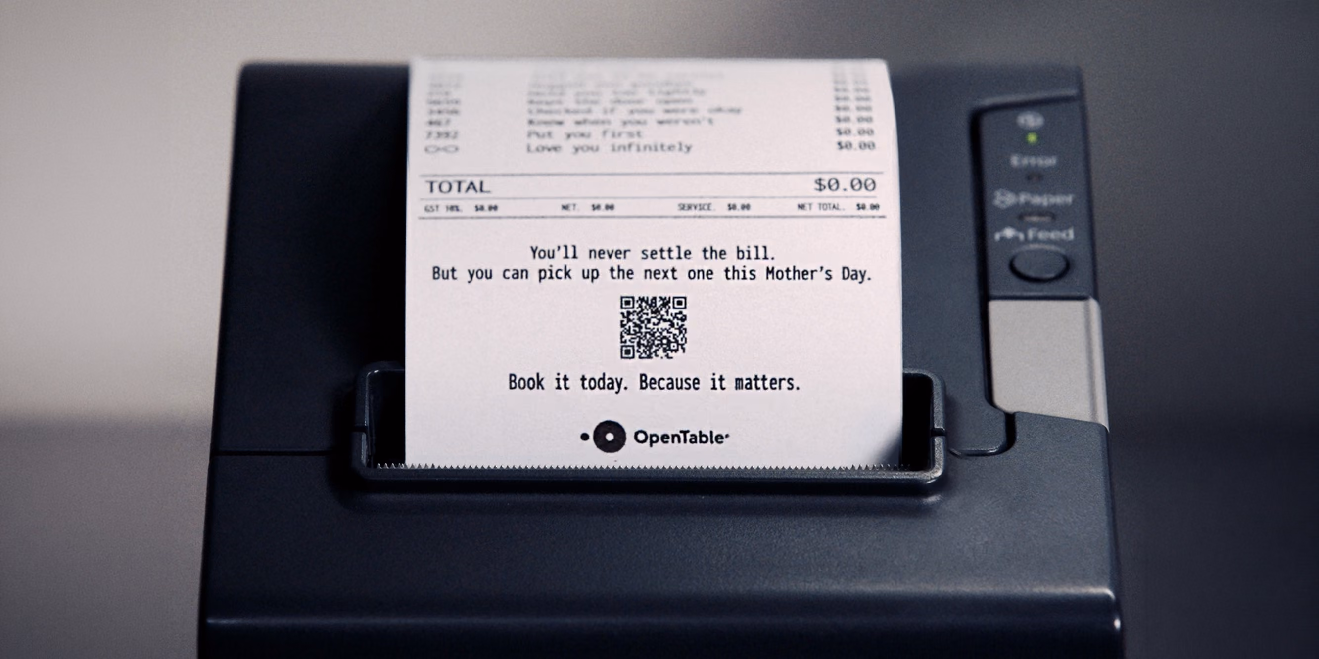
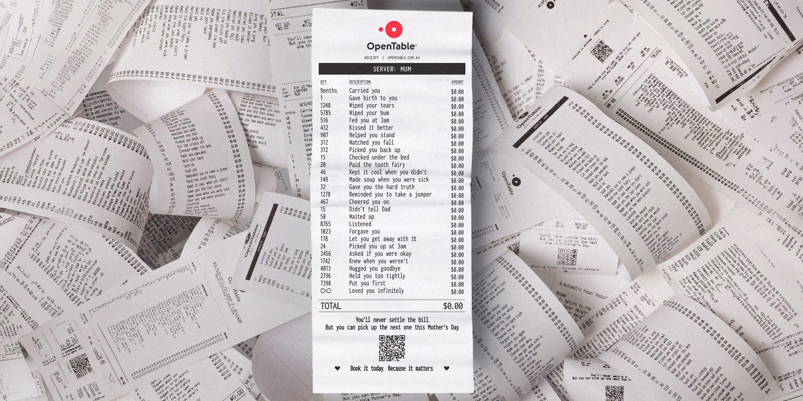
Most Mother's Day campaigns reach for warmth first and find their idea somewhere inside it. This one did the opposite. It started with something cold: a restaurant receipt. Monospace font, two-column layout, a running total. The most transactional object in the building. And then it filled that object with the one thing money has never touched. That inversion is where the campaign earns its keep. The formal language of commerce, quantities, line items, totals, applied to carried you, checked under the bed, didn't tell Dad. The contrast isn't played for laughs, though there's something quietly funny in seeing "wiped your bum: 5785 times" rendered in receipt format alongside a $0.00 charge. What it actually does is make the weight visible. These aren't sentimental gestures listed in a card. They're itemised. They're counted. The receipt format implies that someone sat down and did the accounting, and the accounting came back with the same answer it always does. The physical scale matters enormously here. This is not a social post. This is not a digital billboard. This is a structure suspended inside one of Melbourne's busiest shopping centres, on the one day of the year that building is full of people looking for a way to say thank you with a gift they're not sure is good enough. The installation meets them at exactly that moment of inadequacy, and makes the math explicit. You are not going to settle this bill. Not today. Not ever. But you can pick up the next one.
The Line On The Bottom Of The Receipt.
You'll never settle the bill. But you can pick up the next one this Mother's Day." That closing line is doing the heaviest lifting in the campaign, and it earns it. It doesn't ask you to feel something. It gives you a way out of the guilt it's just created. That's a specific kind of copywriting intelligence: build the emotional pressure, then hand the reader an exit that requires exactly the action the brand needs. The QR code follows naturally from that. Not as a hard sell, but as a relief valve. What the receipt format opens up is something most seasonal campaigns miss: specificity. "Knew when you weren't" sits on the same bill as "made soup when you were sick." Both are $0.00. The quantity next to the first one is 1742. That number is not sentimental. It's devastating in the plainest possible way. It says someone counted. It says she always knew. It makes the abstract concrete, and the concrete is what makes people stand still in a shopping centre and actually read an ad. There's a generation of people who will see this installation and feel it differently depending on where they are in their own story. The twenty-three-year-old who moved away from home last year. The father who lost his mother two Mays ago. The kid who forgot to book until now. The receipt doesn't try to speak to all of them. It just puts the numbers on the paper and lets each person do the rest. That restraint is the work.
Our Take.
The campaign is excellent and the concept is airtight. The one gap is time. This installation lived inside Melbourne Central for what was presumably the week leading up to Mother's Day. Then it came down. But the receipt format, the itemised-acts-of-love idea, is something people would have put their own names on if given the chance. We'd have built a companion digital experience: a simple page where you input your mum's name and generate a personalised receipt. Not gimmicky, not templated. The same monospace aesthetic, the same $0.00 on every line. You pick the acts that apply. You add the quantities as best you can remember. You download it, you send it, you print it and tuck it in with the restaurant booking confirmation. That makes the installation the inspiration and the digital tool the action. The QR code on the physical installation could have gone there instead of (or alongside) the booking flow. The brand gets two moments of engagement per person: the one at the receipt, and the one at the table. The campaign already knew that guilt converts. It just stopped one step short of giving people somewhere to put it that felt personal. The receipt format was always the idea. The installation proved it could carry a room. The question now is whether 2045 takes it global next year, because it absolutely should.