Same Legacy. Same Mark. Sharper Edges
Alhamrani Group of Companies. Decades of Saudi heritage. A brand evolution that preserves the equity and modernises the form across mark, applications and a new website.
Freshen up our look. Our identity was developed 30 years ago.
Alhamrani Group of Companies — one of the foremost private sector companies in the Kingdom, with a portfolio that has mirrored the growth of the Saudi economy itself — came to us with a brand that hadn't moved in three decades. The brief was deliberately modest: freshen up the look. The strategic question underneath: how do you do that without losing the equity? The answer wasn't a rebrand. It was a brand evolution. Minimalism, the way forward.
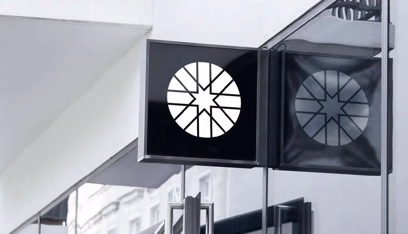
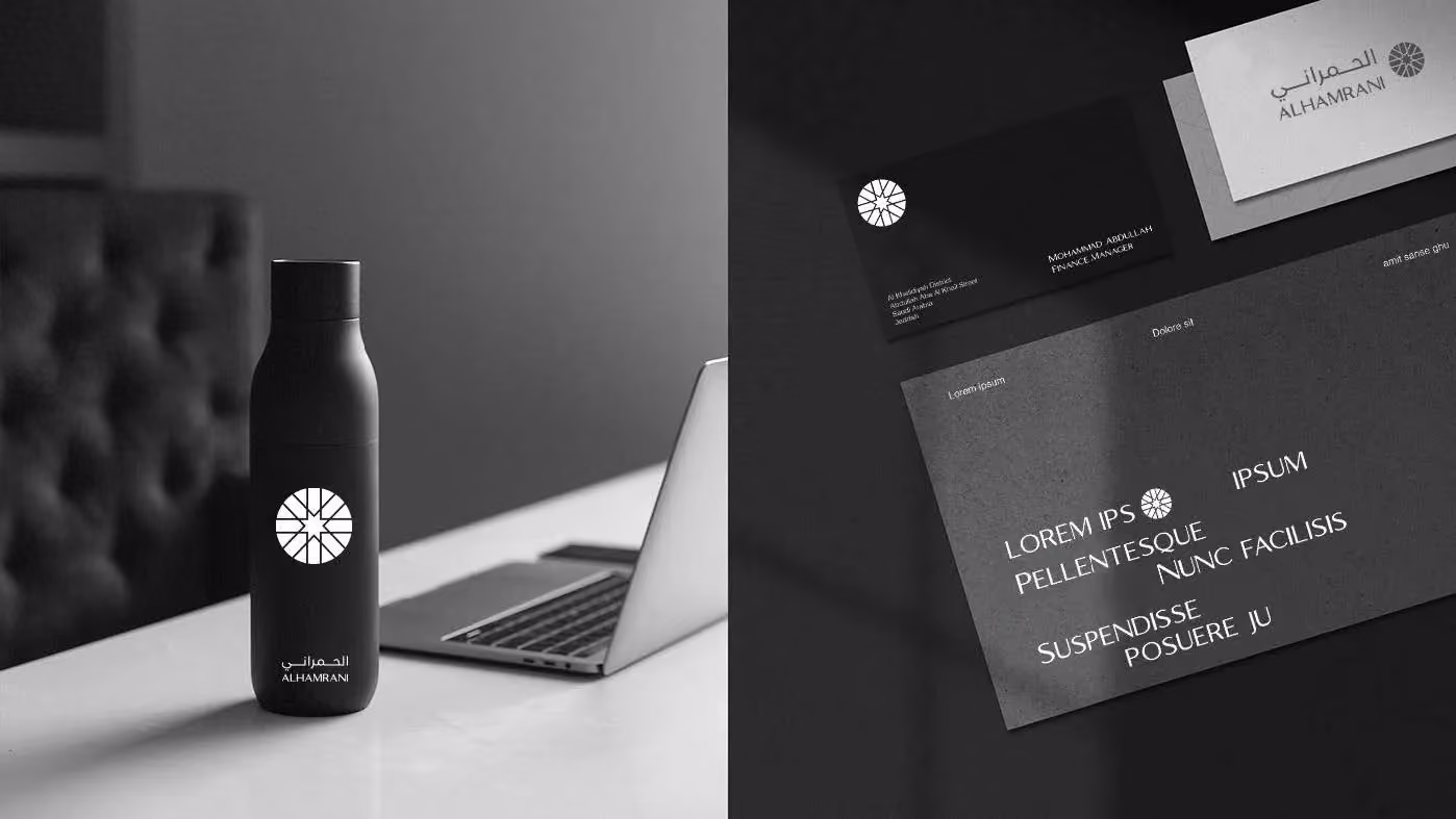
Kept the mark. Lost the noise. Modernised the form.
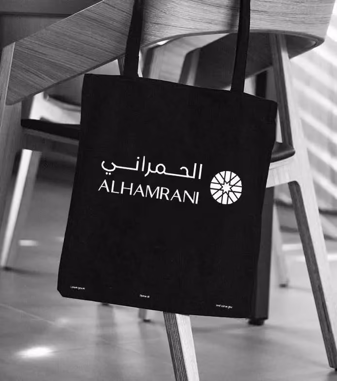
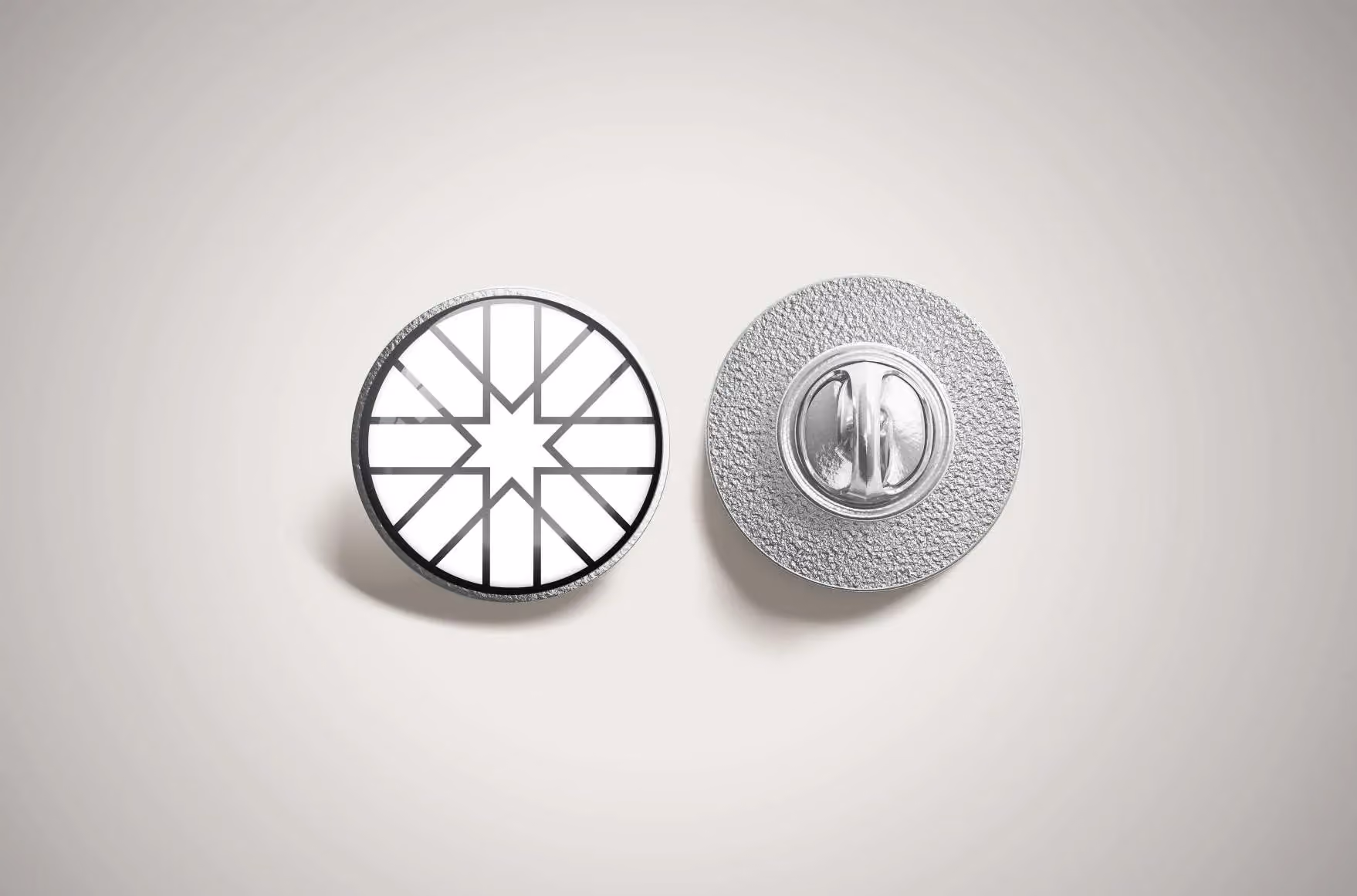
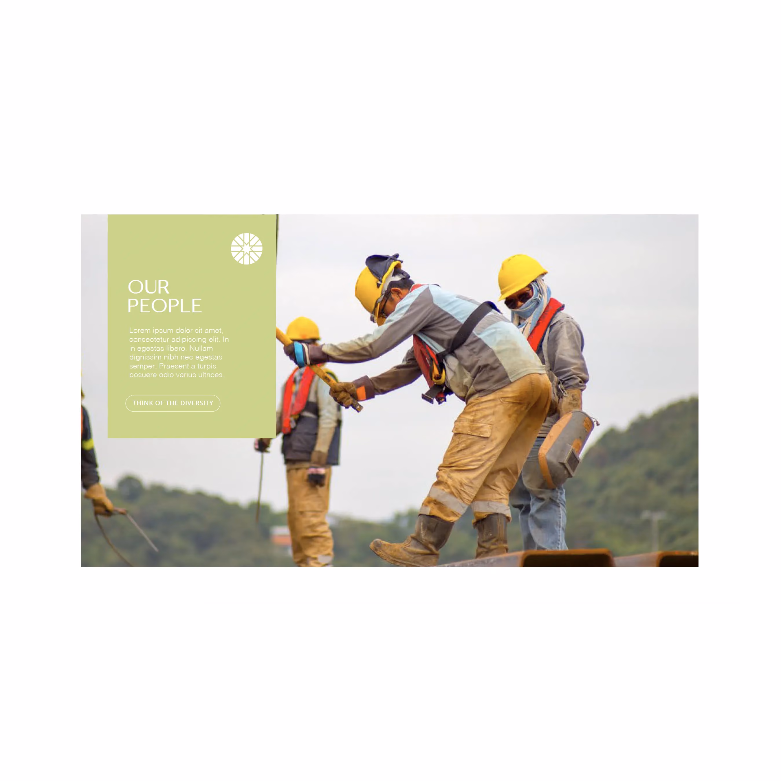
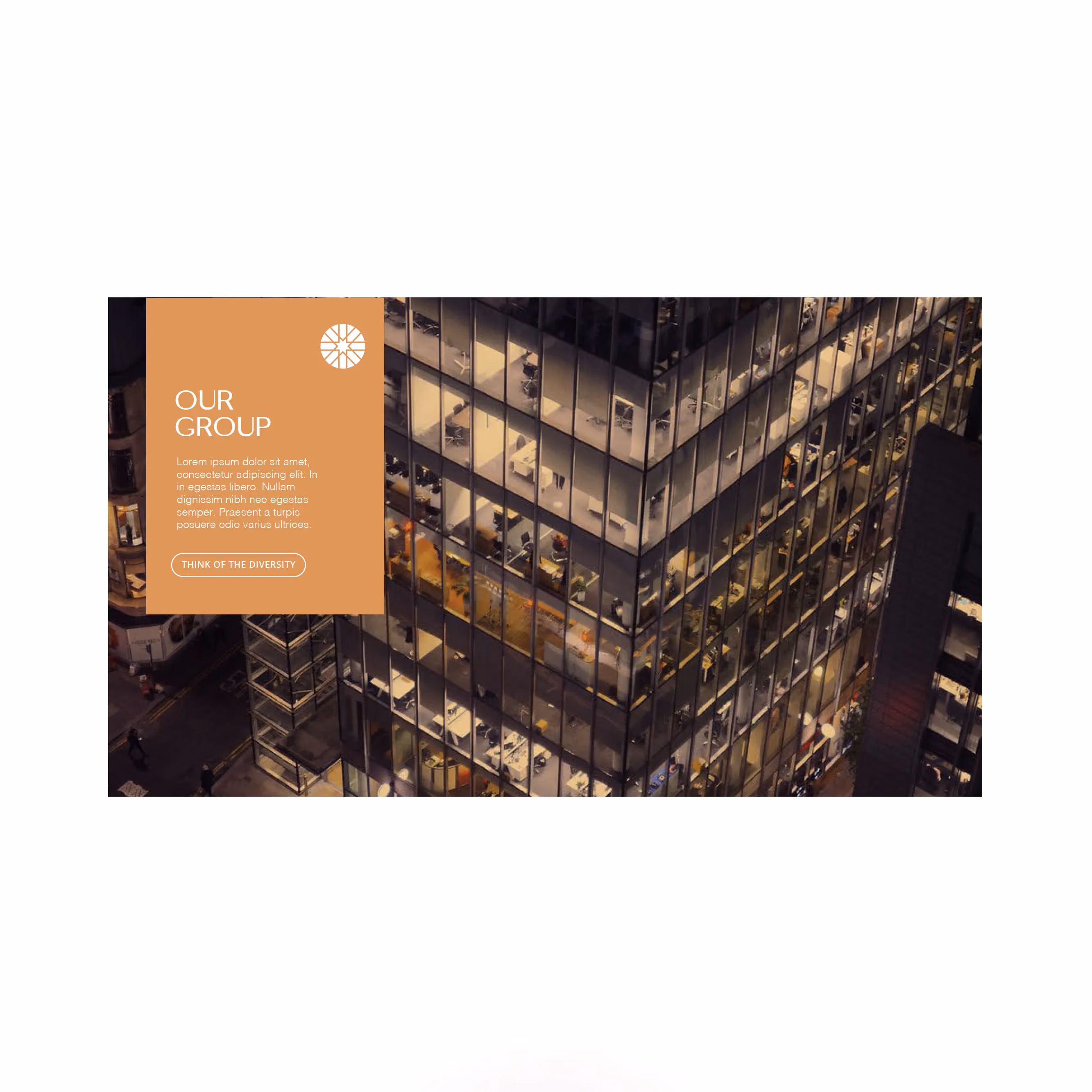
We preserved the iconic geometric mark — the same star-on-circle the brand has owned for a generation — and stripped it back to a single colour. The gold gave way to a considered dark grey. The wordmark tightened. The lock-up rationalised. A flexible visual language followed for stationery, signage, vehicle fleet, merchandise, roll-up banners and a new website that carries the heritage forward (People. Leadership. Growth. Since 1951). Knowing the trends matters. Knowing what the client actually wants matters more. It took us a few rounds. We got there.
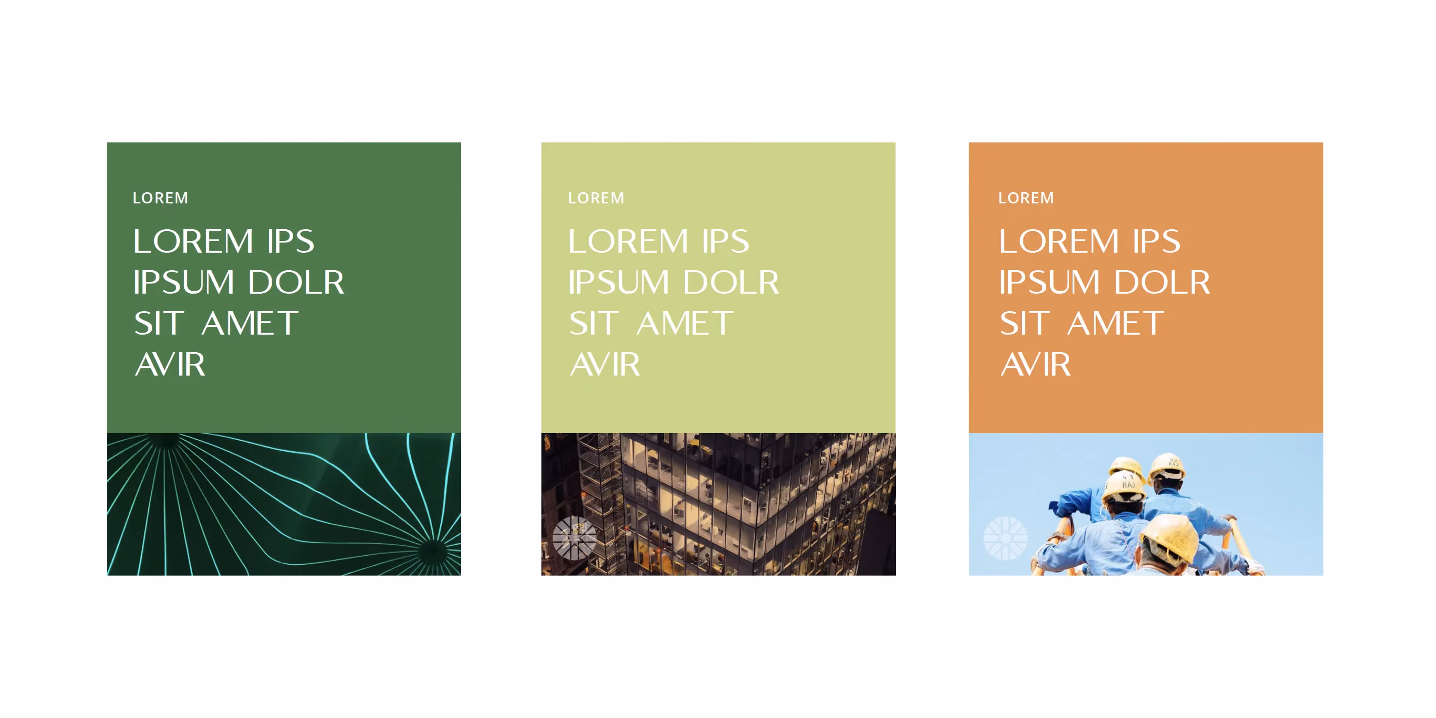
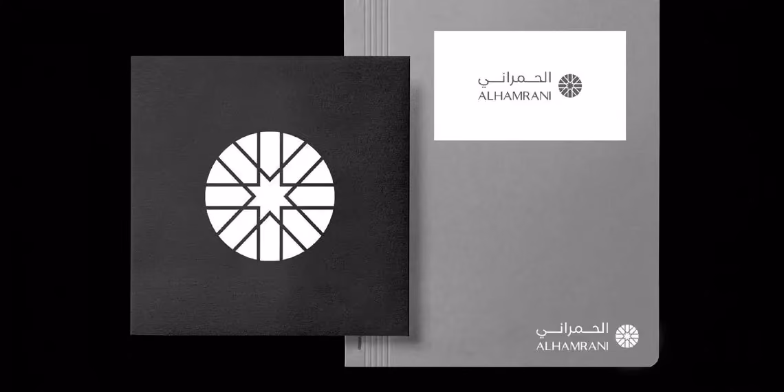
Alhamrani Group launched with the same equity, sharper edges. The mark customers had recognised for a generation, modernised without being unrecognisable. A visual system that flexes across automotive, finance, lubricants and a portfolio of operating businesses without losing coherence. The Kingdom's economy has moved a long way since 1951. The brand finally moved with it.