A Sando Concept that Refuses to Whisper
AniSando. A Japanese-meets-Middle-Eastern sandwich concept. A brand as loud, playful and appetising as the food. Built for social, packaging and storefront.
Make the brand as appetising as the sandwich.
AniSando is a Japanese-meets-Middle-Eastern sando concept — and the brief asked for an identity to match: loud, playful and as appetising as the food it sells. Built to land on social before the storefront opens, on packaging once it does, and on the queue forming outside it after. Quiet was not on the table.
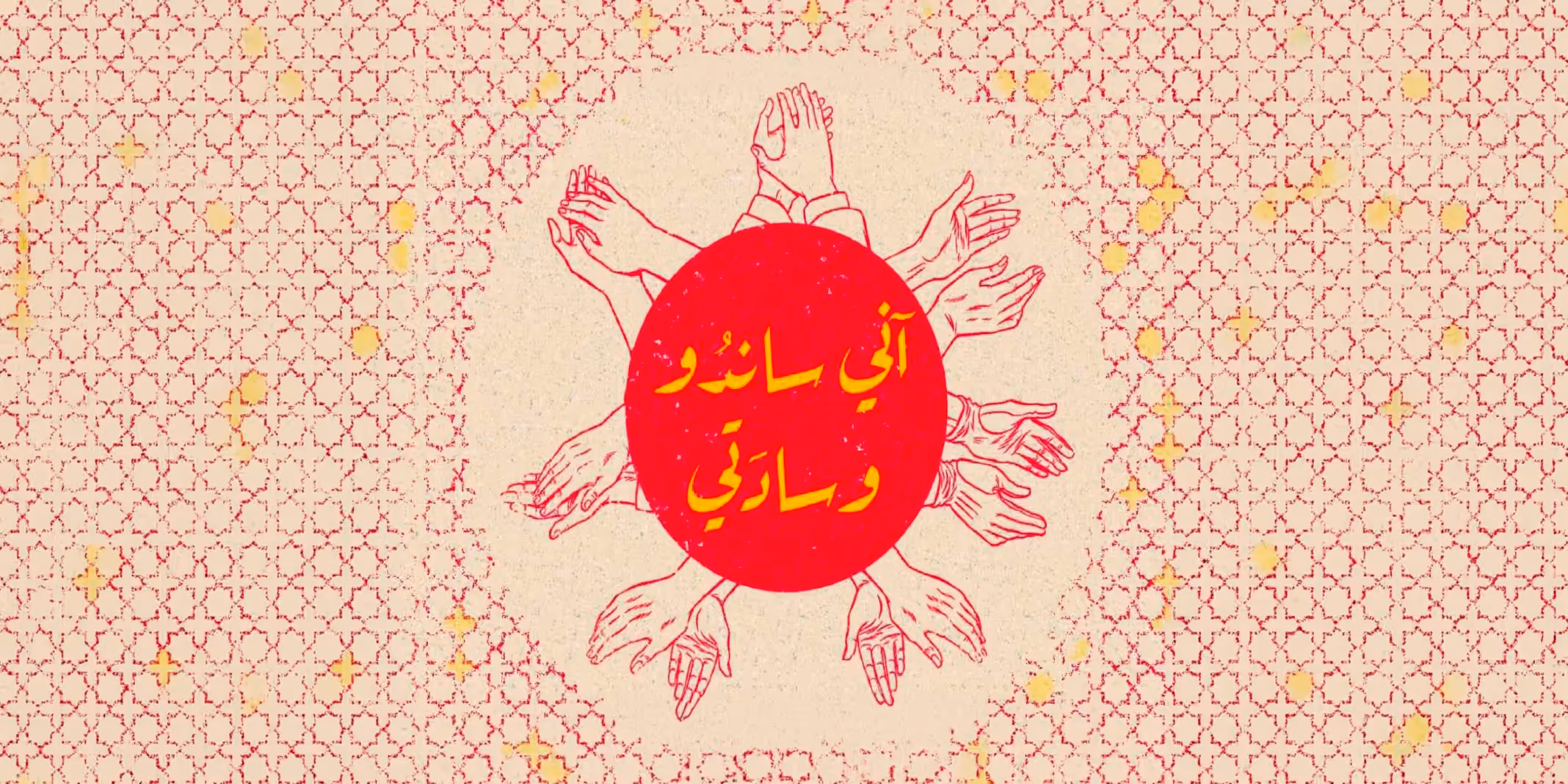
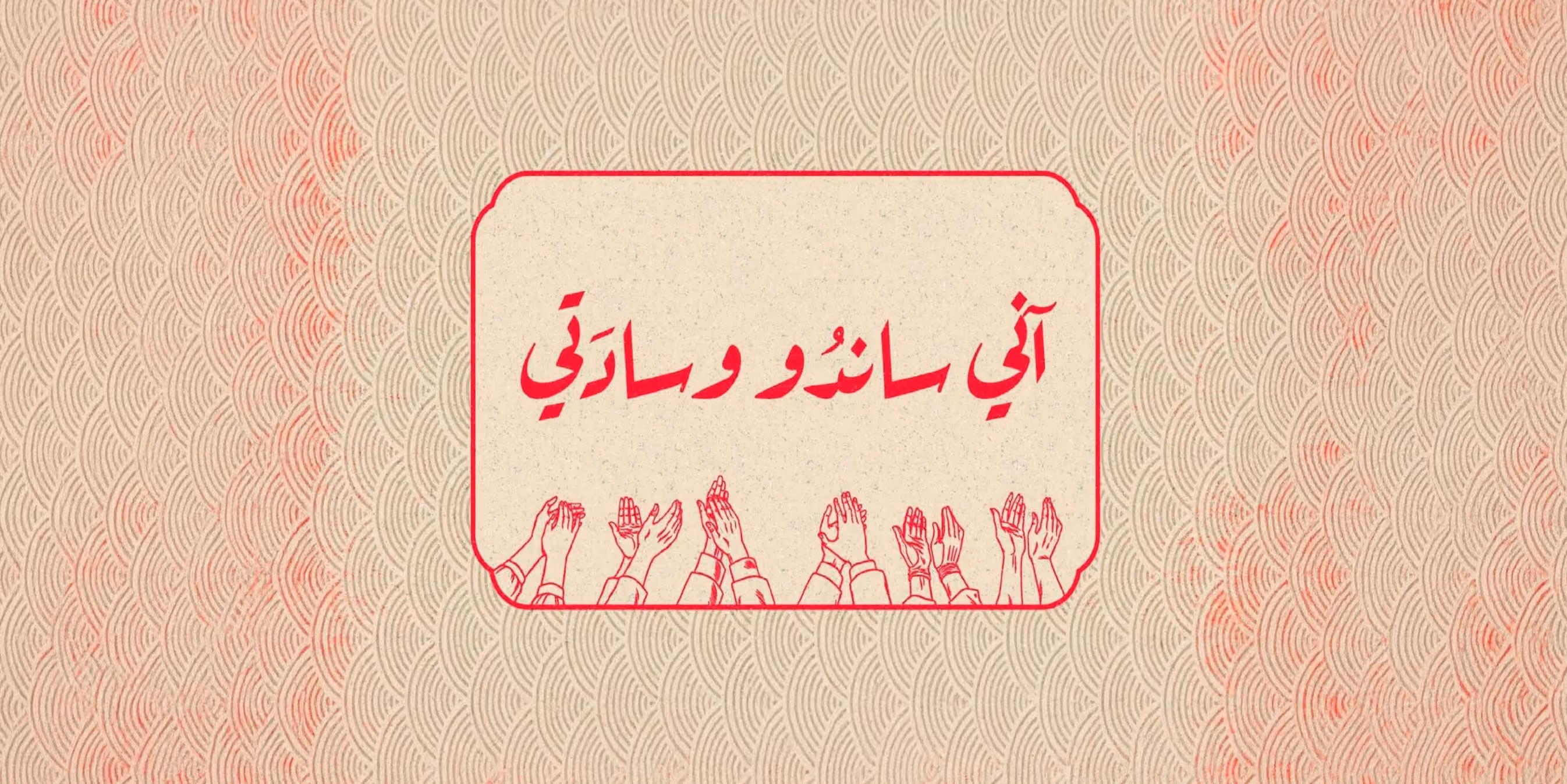
Neon. Wordmark. Manga. Built loud.
A neon-bright identity with a custom wordmark, manga-inspired illustrations, type that punches, and a colour system that refuses to whisper. Packaging, menus, social and launch assets — all built in full, in the brand's own language, ready for a queue.
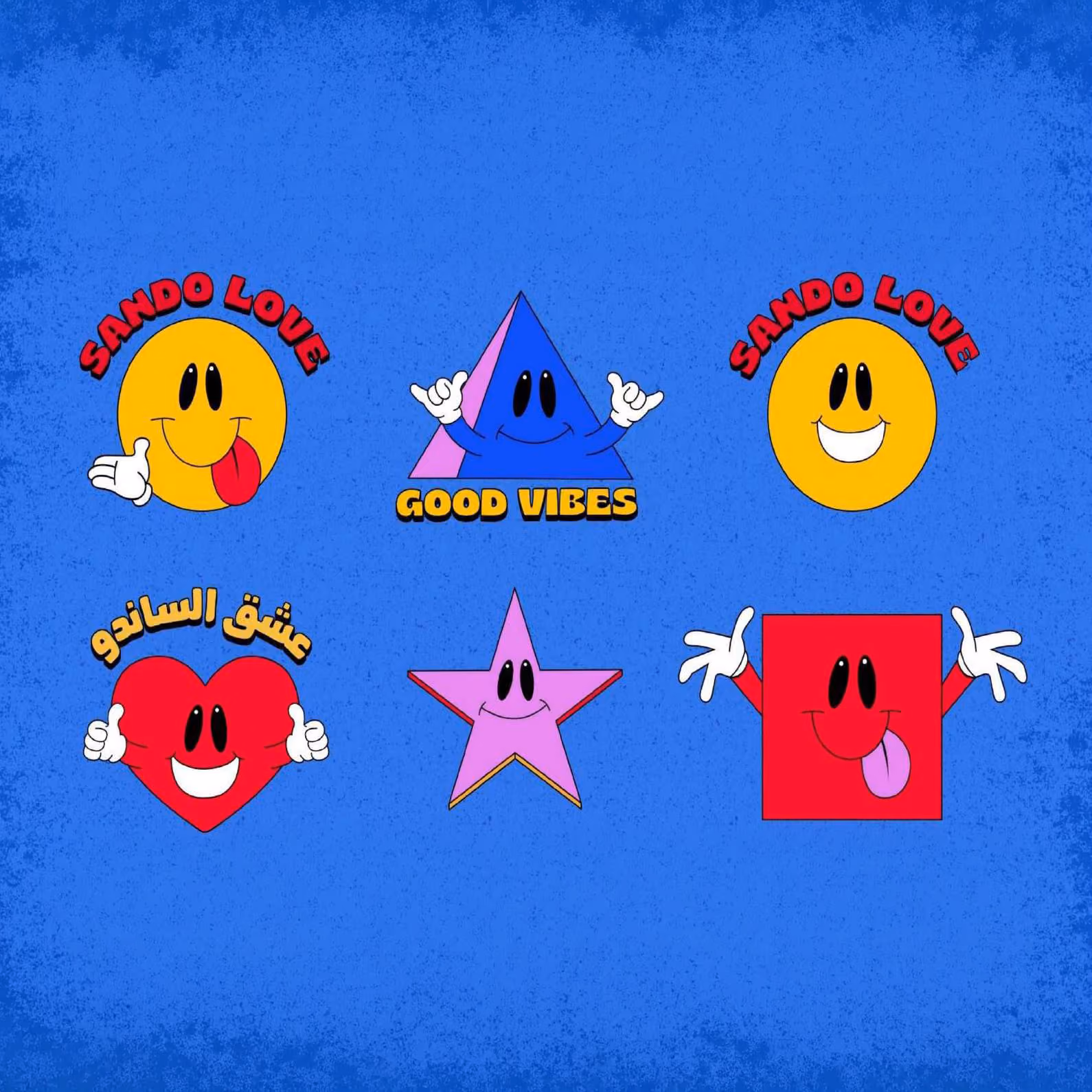
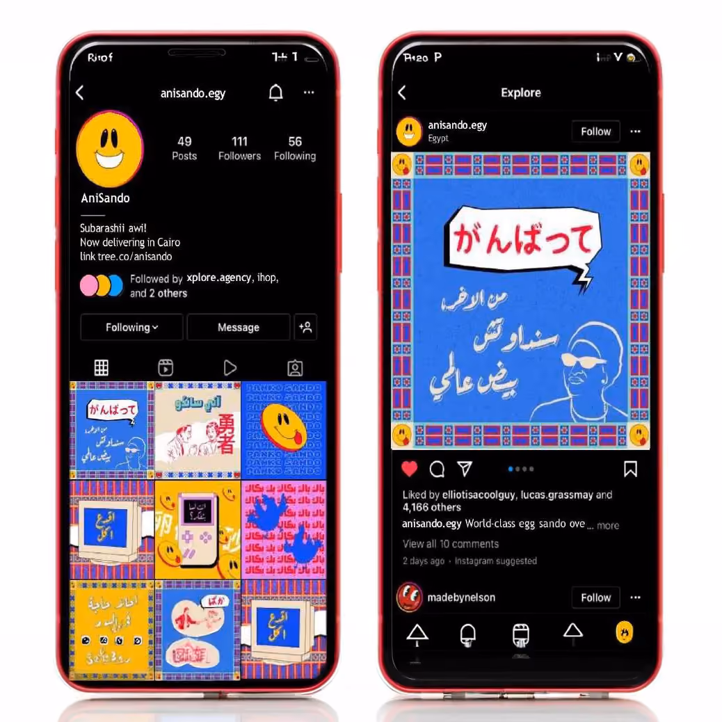
AniSando opened with a brand that does what the food does — leans in, punches, and gets photographed. Packaging customers want to keep, a wordmark that travels from storefront to social cleanly, and a colour system the menu lives inside. Loud isn't always the right answer. When it is, do it properly.